
Law firms need to emit an air of respectability, trustworthiness, and dependability. Since a logo is often the first form of communication between law firms and prospective clients, it significantly impacts how the public perceives the law firm.
Cheesy commercials might get the word out there, but they won’t get you anywhere with finding clients for your business.
Logos are an essential part of branding a law firm. You need to make sure your law firm logo stands out from the crowd and conveys the right message. For this, your logo needs to be designed by a professional.
Here are the hottest design trends for law firm logos to help you communicate your logo needs to a designer:
Type of Logo
There are several different kinds of logos. Here are the best logotypes for law firms:
- Monogram: Monograms are font-based logos. They use the initials of the name of the law firm to create an innovative design.
Monograms are popular as law firm logos since they often have multiple names in their company name. They help increase recognition, especially when the term of the law firm is quite long.
- Wordmark: Wordmarks are also font-based, but they use the firm’s full name instead of the initials. Companies with short names prefer this kind of logo.
- Icon: These logos use a popular symbol to represent the firm. For law firms, this is usually the lady of justice or balance scales.
- Emblem: Emblematic logos are very traditional. They use crests or banners and convey an air of gravitas.
Graphics
Here is a list of typical graphics used in law firm logos. They can be customized and stylized to achieve the tone and image you wish to convey to potential clients.
- Courthouse: Using a courthouse graphic is the most popular way of designing law firm logos. It is simple, straightforward, and isn’t ambiguous or confusing.
- Balance Scales: Balance scales are also a widespread image in law firm logos. They are a little overused these days. Nevertheless, if they suit the image you are trying to convey, you should go for it.
- Law Books: This could help convey your dedication to research and the excellent credentials of your lawyers. Besides, everyone already associates the study of law with thick tomes of books.
- Suit and Tie: This could be a little ambiguous since many corporations use this logo too. It can also feel exclusive to women, especially when there are a lot of female lawyers at your firm.
- Gavel: A judge’s gavel is also a good graphic for a law firm logo. Make sure to conduct a lot of research beforehand because many law firms use this graphic.
You don’t want to be confused for a different firm because of an overly similar logo.
Fonts
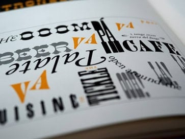
Serifs and scripts are the most popular fonts for law firm logos. They convey an air of tradition, respectability, and dependability.
Using bold type is recommended because it helps give more weight to the logo. We also pay more attention when things are bold, so it helps with audience retention too.
Do not use more than two fonts in a logo, and avoid childish or silly fonts.
Final Thoughts
A logo is a significant part of branding for a law firm. With these popular design trends, you will be able to commission a suitable, innovative, and trendy logo for your law firm.